Project Description
Case Study: Overview
TMPro is a large white label product developed by Ticketmaster UK for online ticket sales and ticket management for a wide variety of their sports and theatre clients. Some major clients include Premier League football clubs such as Manchester United, Arsenal, Tottenham, Aston Villa, West Ham United and Fulham FC.
Ticketmaster had identified the need to update the TM Pro product to accommodate the increasing amounts of mobile traffic the product was experiencing. I joined the Ticketmaster team on a 9 month project, with the specific aim of producing a responsive, mobile first first end design for the platform.
Building a responsive pattern library
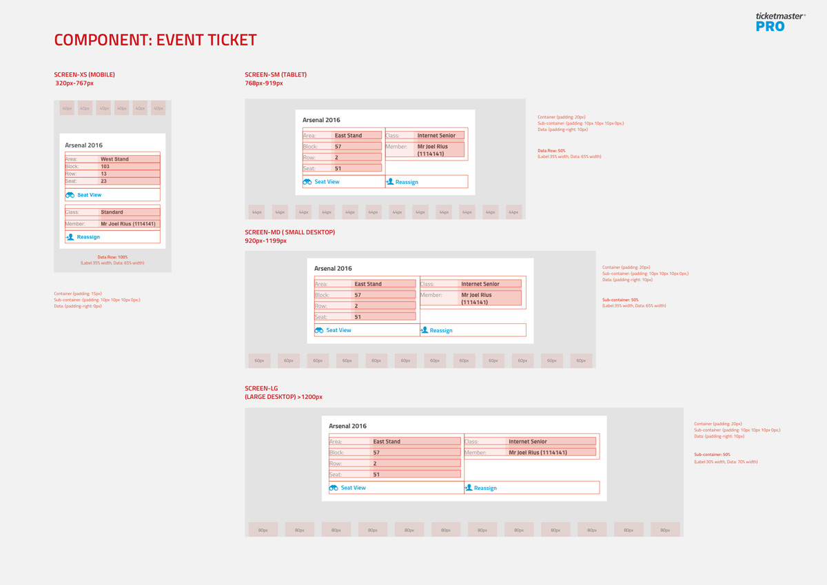
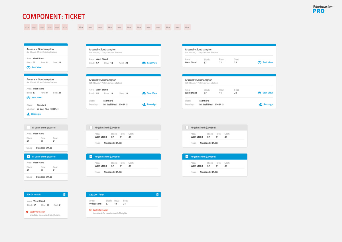
It was important to firstly understand how the existing produce worked and behaved and we started by closely examining the existing product in collaboration with the development team, looking at specific user journeys, what data users were required to input at what time as well as what outputs and information were needed to be displayed. As we broke the site down we started to identify patterns and specific components blocks that could be drawn out and used throughout the redesign.
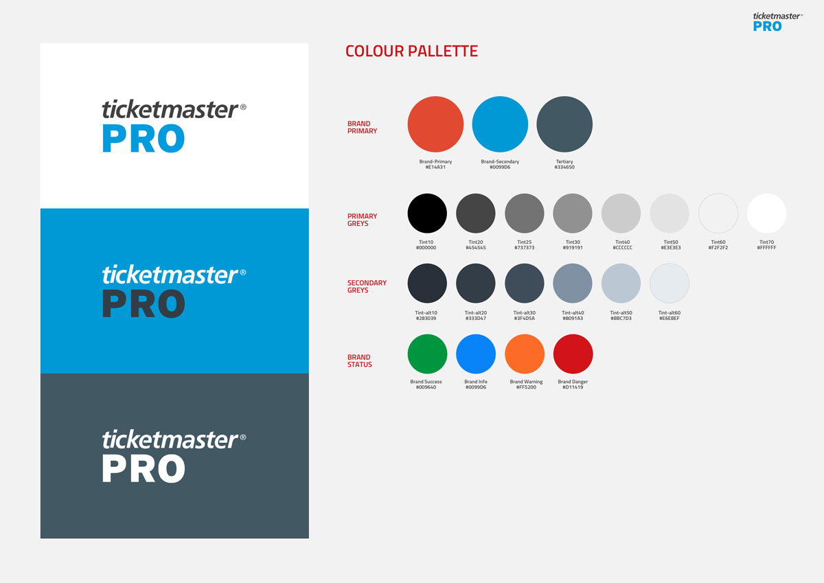
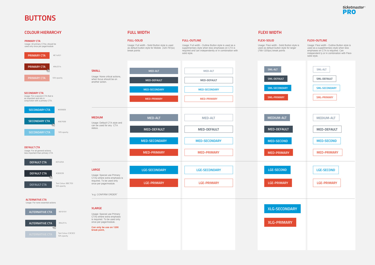
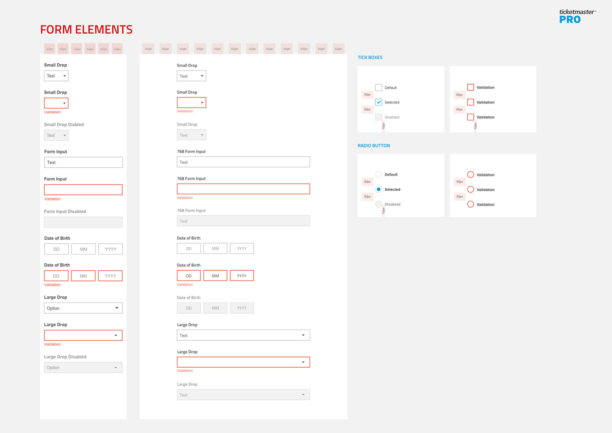
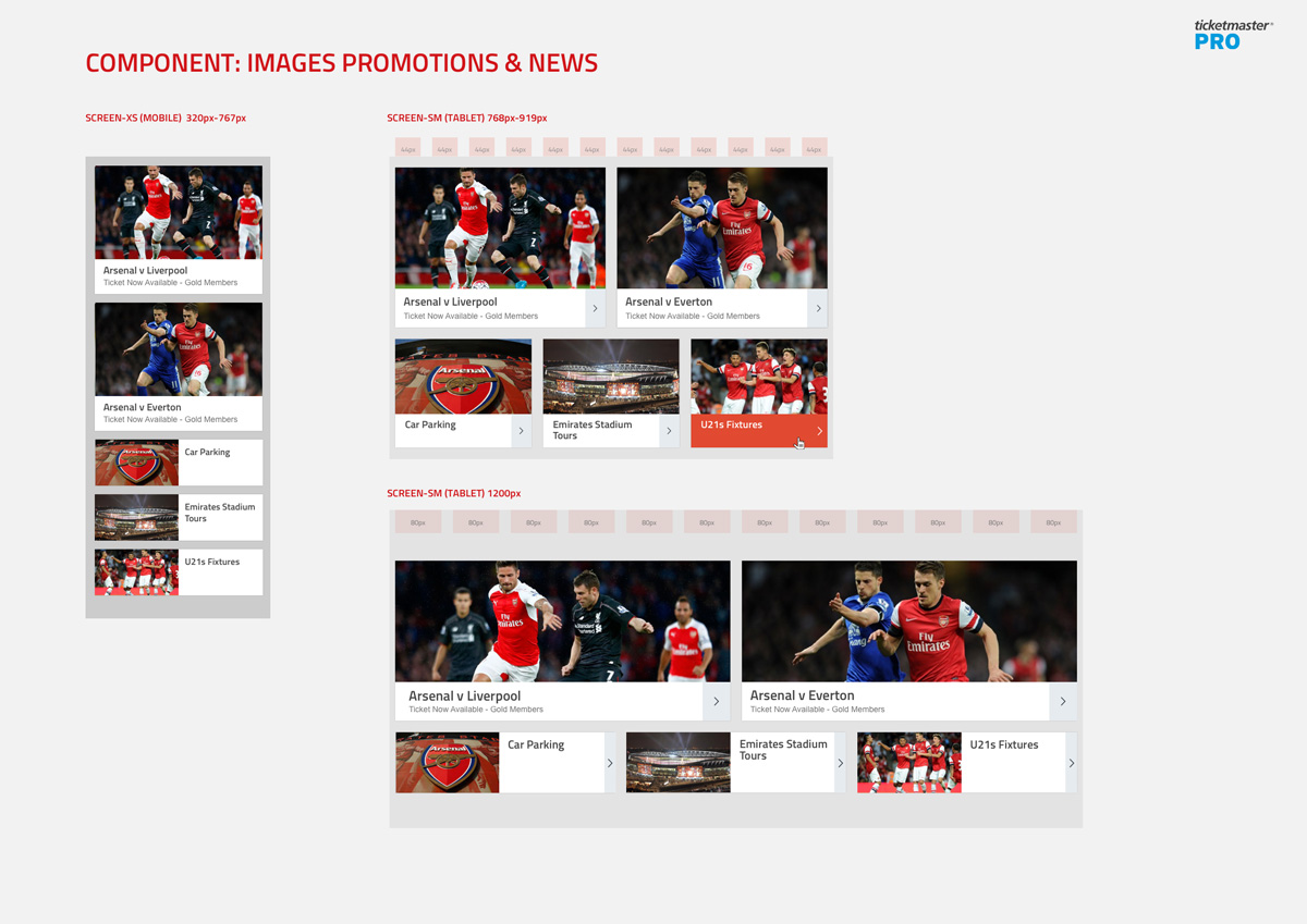
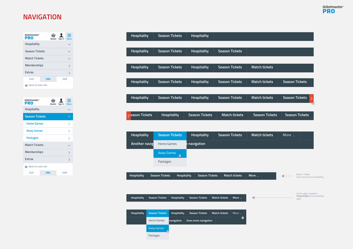
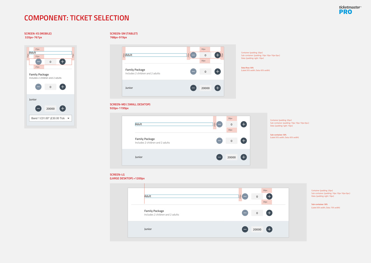
Due to the complexity of the TM Pro product, we quickly identified that adopting a modular approach for the design would help us to create a more effective and deliberate UI design system. We consolidated existing components into a number of core groups that could be redesigned in isolation and documented in a new pattern library.
Using a modular or atomic methodology for complex and configurable white label site like TM Pro helped to make testing and QA easier, encouraged reusability of code and created consistency while dramatically helping when re-skinning the product for individual clients needs.
What is Atomic Methodology?
A modular or atomic design methodology is composed of five distinct stages working together to create an interface design system which is more deliberate and has a hierarchical structure. The five stages of atomic design are:


Objectives for the redesign:
Simplifying the visual language to be cleaner and uncluttered to enable users to digest information with minimum distractions.
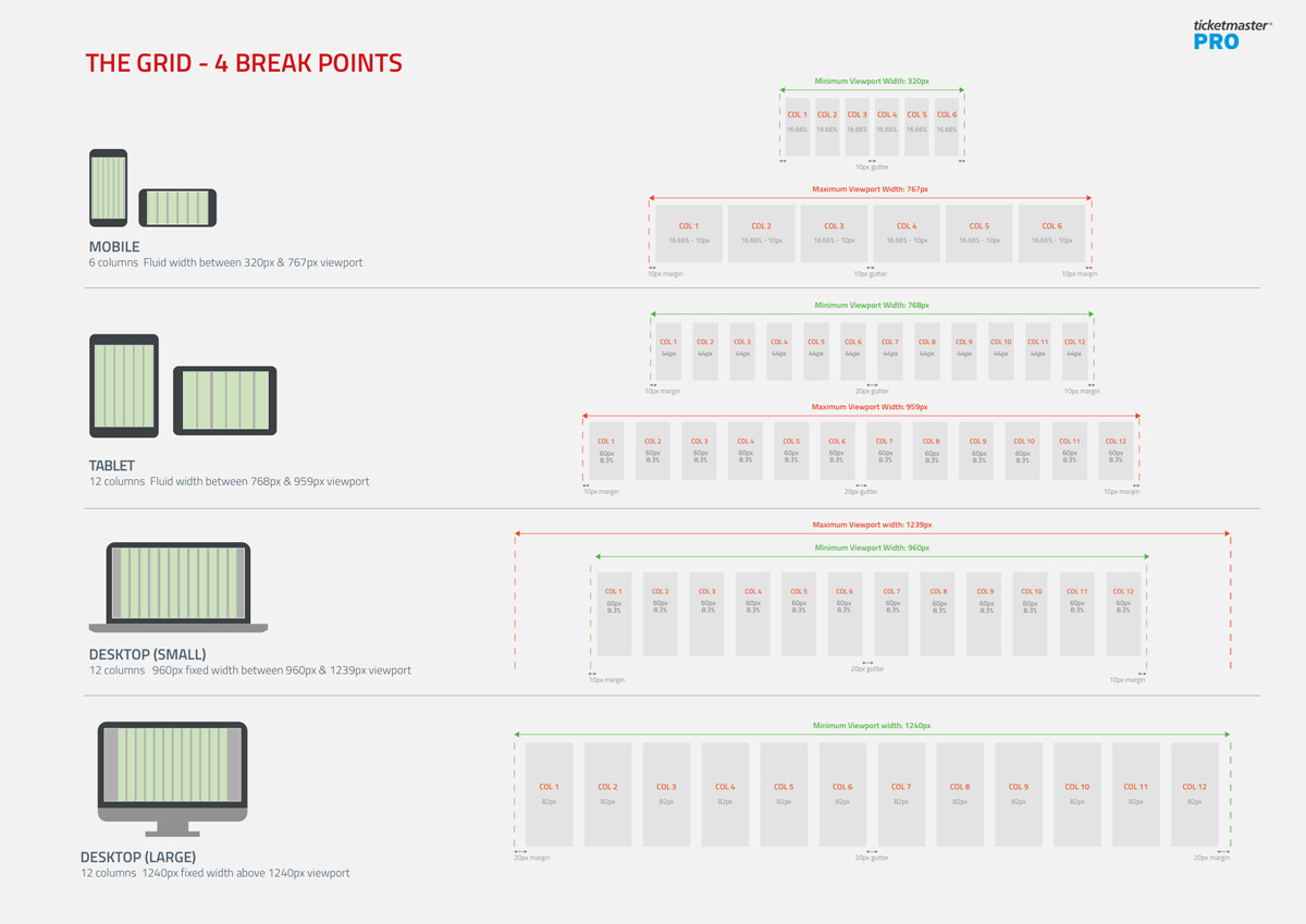
Defining a responsive grid that is fluid and flexible to provide a consistent and accessible experience across the many variations of screens.
Defining typographic rules to create hierarchy, clarity and scan-ability of information.
Designing a consistent iconography style to help give more context to content.
Finding a tone of voice for labels and messages to be friendly and human while being clear and informative.
Establishing better defaults for components to help to reduce the amount of user inputs.
Using familiar UI elements to help with efficiency and familiarity with existing users.
Defining design patterns
We produced documentation in close collaboration with the development team to ensure consistency between the design patterns and the front end code. Once the basic component documentation was in place this became the foundation of the new responsive product and helped us to construct templates, pages and prototypes much more quickly.
As we worked through different parts of the site often the need for new patterns emerged, so we found the need to sometimes reconsider components or create variations of components to give maximum flexibility to the product.
Ticketmaster eventually plan to construct a full online version of this component documentation for TM Pro including how different skinning options behave. This will add further value as the platform evolves and new features are added.
