Project Description
Project Overview
The product team wanted to explore a proposition for launching a new native app with the primary aim of increasing the listener hours for live or on-demand content across the TalkSPORT network. Other requirements were to look at the potential to utilise listener data to better enhance the user experience.
Previous user research had identified three areas of opportunity that needed to be explored and validated for a new app proposal. We planned three design sprints to help explore these areas using the ‘Google Ventures Design Sprint’ approach to enable us to rapidly test tangible concepts with users to quickly evaluate and validate our thinking and therefore help establish a roadmap for an MVP product.
Our 3 sprints of work would cover:
- Enabling Discovery
Giving users a platform for discovery of events, shows and podcasts.
Previous user feedback:
“I want information and recommendations from sources I trust, on topics I care about
Two way conversation
Giving users tools to help to part of the conversation and shape the debate
Previous user feedback:
“I want to be able to get involved in the conversation and debate all the time, no matter if it’s live or on-demand”
Better knowing our users
How to better gather details, to be able to recommend content and create habitual use.
Previous user feedback:
“I want to spend more time listening to content relevant to me and the teams I follow”
What is a ‘Google Ventures Design Sprint’ approach?
The process we used was invented by Google Ventures and involves an intensive 5-day design process. Each sprint with the aim to rapidly create and lightly test a solution through exploration, discussion, prototyping and user testing with customers. For me personally, it was the first time I had worked in this way to approach a design problem and I was excited to see how the process played out and what the team could achieve.
The aim of this approach is to shortcut the endless-debate cycle and potentially compress months of design time into a single week. Instead of waiting to launch a minimal product to understand if an idea or feature is any good we hoped to get clear data from a realistic prototype to eventually define an MVP for further development and launch.
During the protoyping phase, we decided to use Principle for Mac and Sketch. These tools allowed us to build a relatively high fidelity prototype and as we were building an audio app, even incorporate audio sound tracks to make the experience even more realistic during the testing sessions. The prototype would also aid discussions with the business shakeholders as we could share something tangible.
This is what a five-day design sprint process looked like:

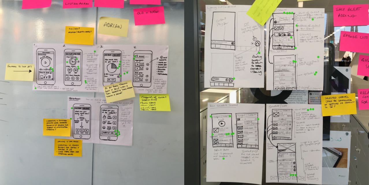

Sprint 1 – Enabling Discovery
The first sprint focussed on how to create a platform to allow users to discover and engage with content. From initially exploration a number of key questions were identified. These included
- How might we… combine audio/text/video content?
How might we… let users react to stories quickly and easily (1/2 taps)?
How might we… give people what they want immediately?
How might we… drive habitual use?
How might we… allow users to plan TalkSPORT around their lives?
How might we… let users bookmark or be alerted by shows?
How might we… use the app to prep the convo for the radio?
Concept Exploration:
The first 2 days of the sprint were designed for exploration and discussion and as a team to immerse ourselves in the design problem. With all this fresh in our minds on day 3 we then split to work independently to sketch our individual thoughts and concepts. We then came back together to discuss and vote on these concepts. We found in some cases that individual ideas could be combined into stronger solutions and through discussion we started to form a solid idea of what concepts could be best to take forward and incorporate into a first prototype for testing.
The key concepts and features we wanted to look at were:
A discovery focused home page with category rails for different content (Netflix style)
Allowing users to set reminders for featured shows and big events
A full radio schedule with links to catch up and listening live
Show and podcast pages with short snackable video clips, full episode lists and related content.
Options to select favourite shows and download audio to listen off line.
Building our prototype:
Before we could crack on and start building anything, firstly we had to establish which user journeys would help us best test our concepts and get the most from the testing sessions. As we were working quickly, this initial step helped us to focus collectively towards a specific end goal and not to waste time building things that wouldn’t be relevant.
At this time the team split the responsibilities, some writing a testing script, some sourcing assets and pictures and some building the screens and prototype itself. We decided to use Principle for mac to build the prototype. This tool allowed us to build a relatively high fidelity prototype and even incorporate audio tracks to make the experience even more realistic. Well we are designing an audio app after all!
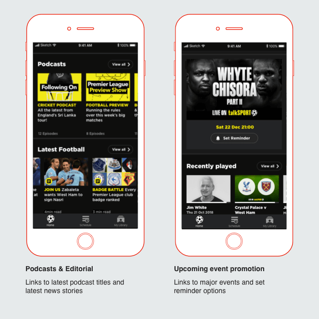
Home page
A discovery focused home page with a themed rails for different content types and categories. We wanted to test users ability to navigate and understand different type of content as well what functionality could be associated including setting reminders for events and adding shows and podcasts to their favourites. We also wanted to gauge user expectations about introducing editorial and personalised content into the mix along side audio content. Other things we wanted to test was the users ability to tap to listen live, switch channels to TalkSport2 and to navigate to the radio schedule.
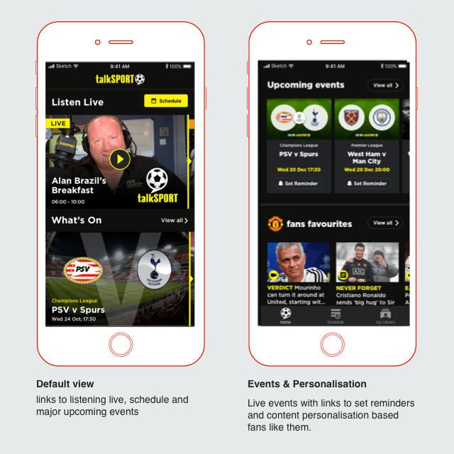
Schedule page
Giving the user the ability to navigate through radio schedule via date and channel. We wants to test users appetite to listen to catch up with older shows and set reminders for future shows as well as how far they would expect to go back and forward in time.

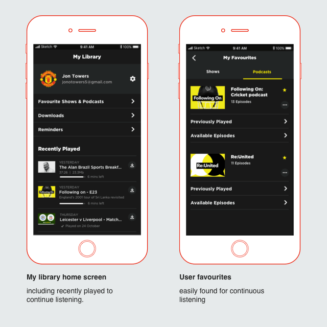
My Library
My library was the area for all users personalised content. We wanted to test the users perceptions and understanding of what happens when they select favourites, download a show or podcast or set a reminder for an event and how they might find this content.
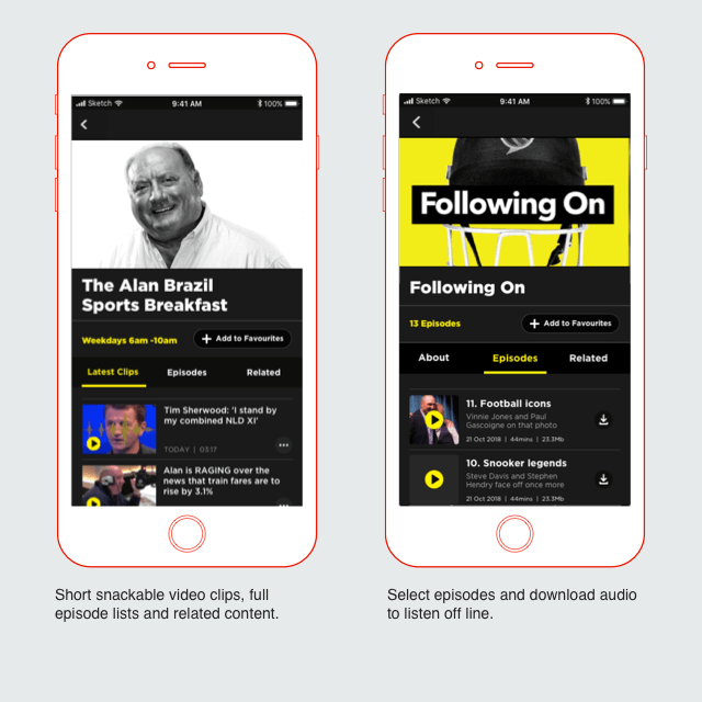
Shows & Podcasts
Show and podcast pages are the area for all things related to that show. We wanted to test users expectations about what might be available here and within the prototype included short snackable video clips, full episode lists and related content. Also options to favourite and downloads episodes.
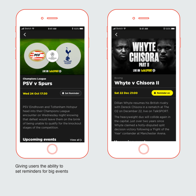
Live Events
Event pages contained all information about an event before time. We wanted to test users expectations about what might be available here including users expectations and perceptions about setting reminders. .
Sprint 2 – Two way conversation
Objective: How can we better use fan’s passion and emotion to drive engagement with the app, making it more convenient for users to take part in the conversation and increase listener hours (live and on demand)
Key Questions we asked ourselves:
- How might we…use push for most engaging news, breaking news and articles?
How might we… set the agenda rather than react to it?
How might we… use events and exclusive rights content to drive user engagement?
How might we… use the app to drive more controversial opinions?
How might we… use post match emotion within the app?
How might we…make the most of key moments for emotion?
How might we…make the most of surges of excitement for a topic/event?
How might we…tap into the passion after the game?
How might we…use simple emotion capture?
Key Concept: “Big Game Timeline”
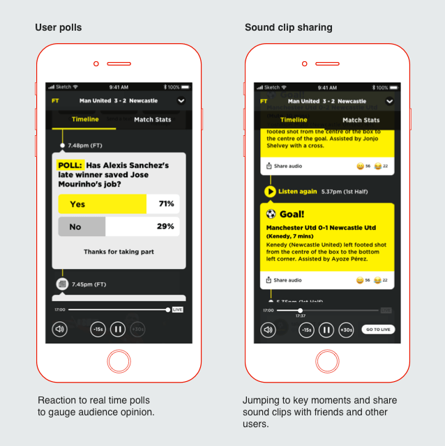
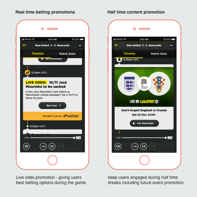
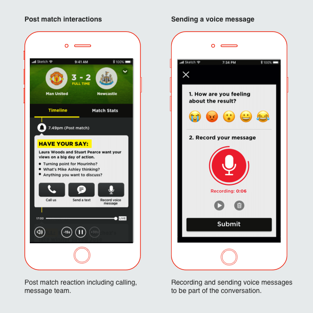
After going through the same process as Sprint 1, we eventually decided upon a concept designed to test users interaction during and after a big game match commentary. This concept would involve a dynamic timeline interface that could be populated during a live match broadcast and include various interactive tools to allow users to interact as the action unfolded. Key things we wanted to test were users appetite to react and share key events during the game (including sound clips from the broadcast) as well as testing user’s appetite to get involved in the on air conversation post match.
We built this second prototype for users to interact while they were listening to dummy match commentary of Man United v Newcastle. For user testing we set 4 scenarios for the users to imagine. 1. Prematch build-up 2. Half time 3. Winning goal being scored 4. Full time. We designed the prototype so that the UI timeline would populate with new content as the game commentary unfolded in these 4 scenarios.
Content items we wanted to test were: opinion polls, social sharing of sound/commentary clips, emoji reactions to key moments, social media snippets from the commentary team as well as commercial options for betting/odds advertising to be contextually displayed.
Our aim was to gauge the opinions and reactions of users to different types of interactions as well as levels of interaction they might enjoy at different moments while listening to the game.

Sprint 3 – Better knowing our users
Introducing sign up to gather user information
In order to turn our unknown users into known listeners, we knew we would need to introduce some sort of sign up process within the app to capture some user data. This was a clear business objective set out by the business for the app and our focus within the third design sprint was to investigate the different possibilities available to do this. We would need to focus on what the value exchange would be for the user to give they data, as well as what details and level of personalisation would be suitable, whether to make the sign up journey mandatory or whether to introduce sign up behind key features.
Key Questions
How might we…make the sign up journey less bothersome/ more delightful?
How and when do we enable personalisation?
How do we provide better and more relevant advertising (and therefore more revenue)?
How do we not interrupt listening?
What is the minimum data requirements to gain value from the user?
Business needs:
Data insights: Get greater insight on our listeners, i.e. the content that they like, when they listen, how they listen, etc.
Marketing: The ability to target new campaigns (email, push notifications, etc.) to segmented listener groups
Sales: Get to build detailed listener profiles to better target on air advertising.
Technology: Introduce tools to enable active and passive personalisation within products.
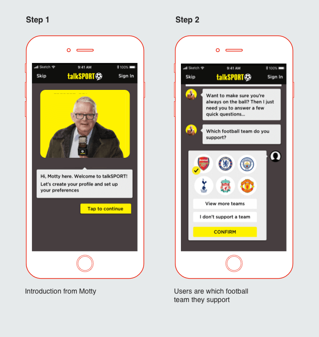
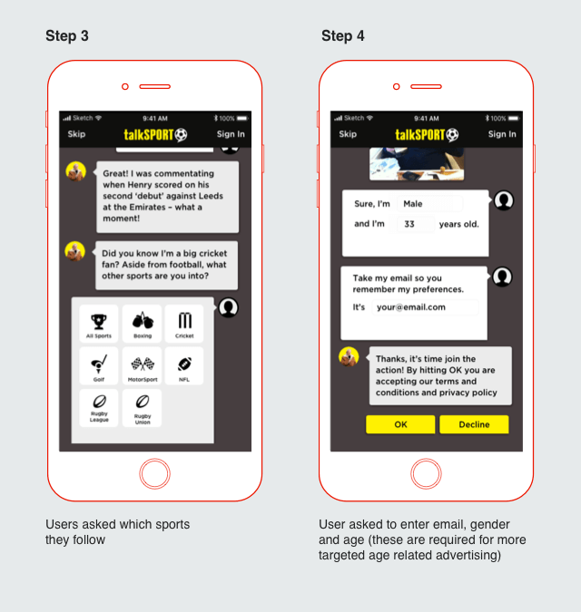
Key concepts: Mini Motty
The concept we decided to test was called “Mini Motty”. The concept involved using football commentator John Motson in a chat bot style interface to help users through a few onboarding questions when the app initially opens. Our thinking was to try to introduce some humour and unexpected delight into the sign up user journey and we wanted to test users reactions to this approach as well as speed of completion and user’s overall understanding of the need to capture data and their willingness to give it.
