Project Description
Project Overview
A four-week project to define the proposition for a new financial, data-focused website intended to help both investors and analysts to better evaluate and assess gold as an investment.
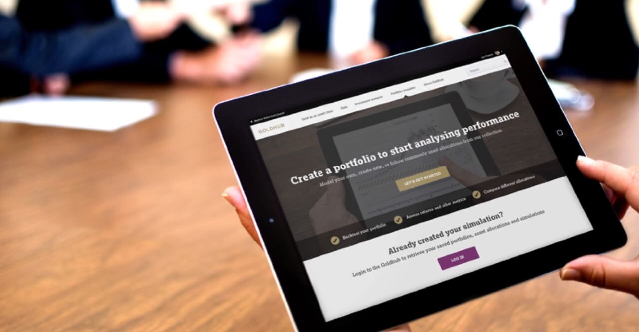
The client wanted to see if it would be viable for them to create a new website product that could be a single source of information for investing. A place that could help to educate novice investors but also include unbiased data sets together with research documents that expert investors could explore and analyse for themselves.
Our brief was to help the client determine how this new service might be presented and to test this with potential users through interviews and detailed high-fidelity prototypes. The client was also keen for us to dig deeper into brand exploration, brand perception, content approach, and information architecture as well as how the product would adapt across different devices and screen sizes.
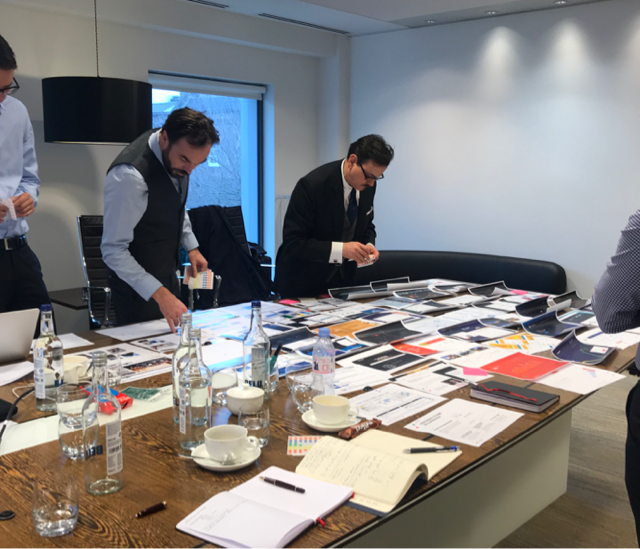
Week 1: Product definition workshops
We ran a workshop with the client team to get a better understanding of the project goals, ideas, requirements, and constraints
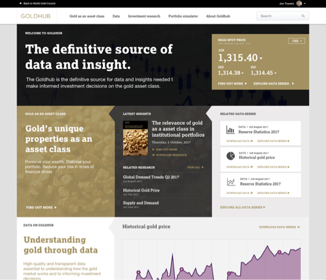
Week 2: Concept design & prototyping
We worked on brand exploration, content approach, and information architecture. We developed wireframes and early concept visual designs.
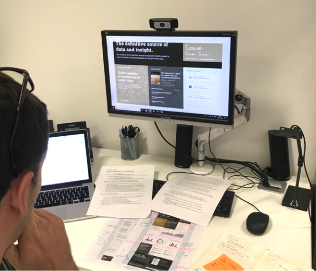
Week 3: User research and interviews
We used designs to run user research interviews with the target audiences, validating our thinking and learning more about user behaviour.
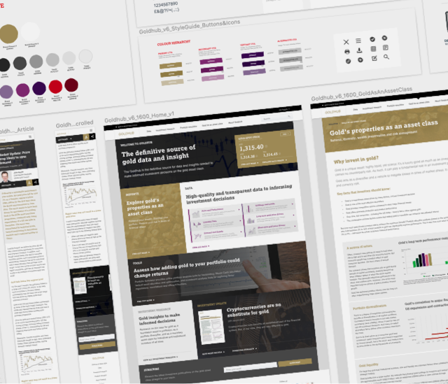
Week 4: Design delivery and documentation
We’ve worked on the small details, iterating designs following research findings and stakeholder feedback, working to refine and document the design solution.
Design direction
Key points defined through client workshops:
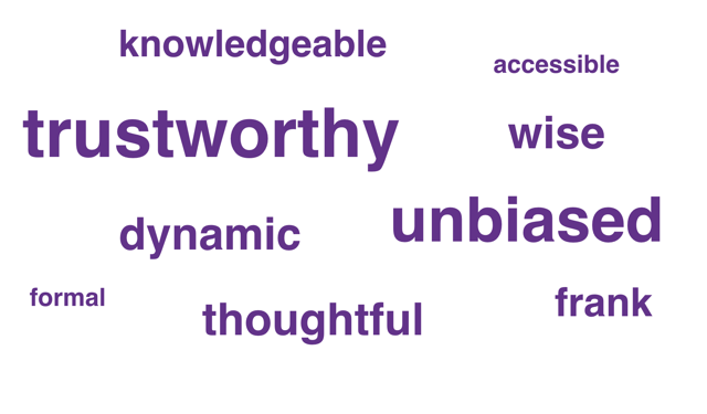
The new service should maintain a tone of voice that is unbiased and trustworthy.
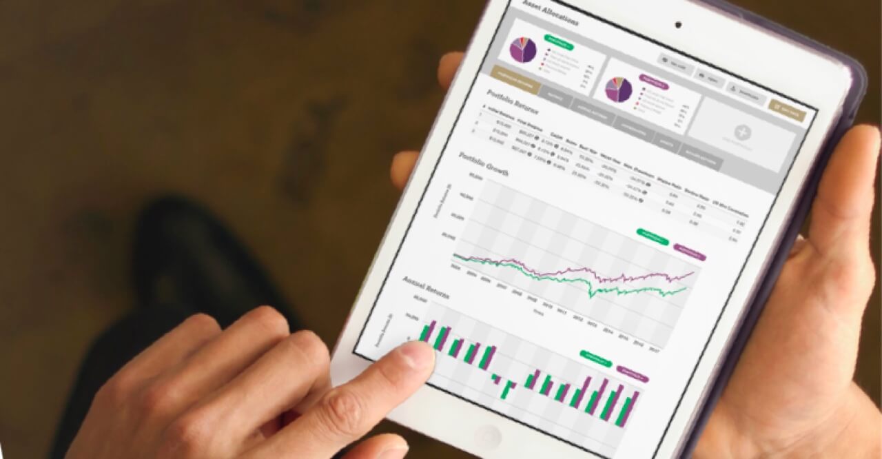
High level data should be presented with opportunities for user to download data for their own analysis.
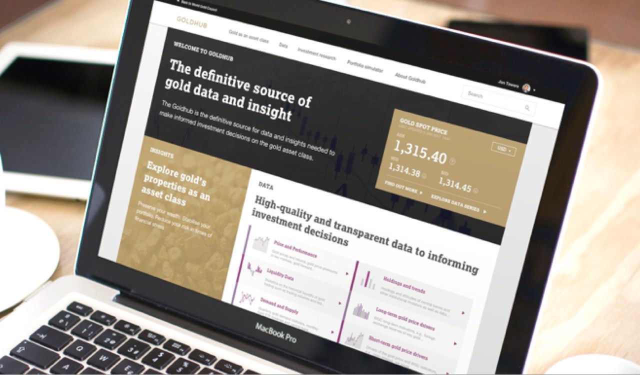
The new service should be dynamic and data rich but easy to digest.
Should have an authoritative feel, fairly formal but also accessible.
The design phase
Defining a basic product style guide:
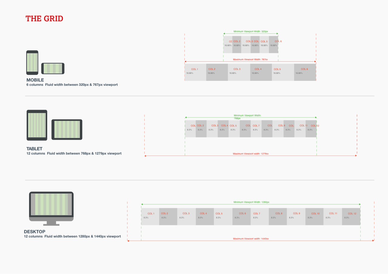
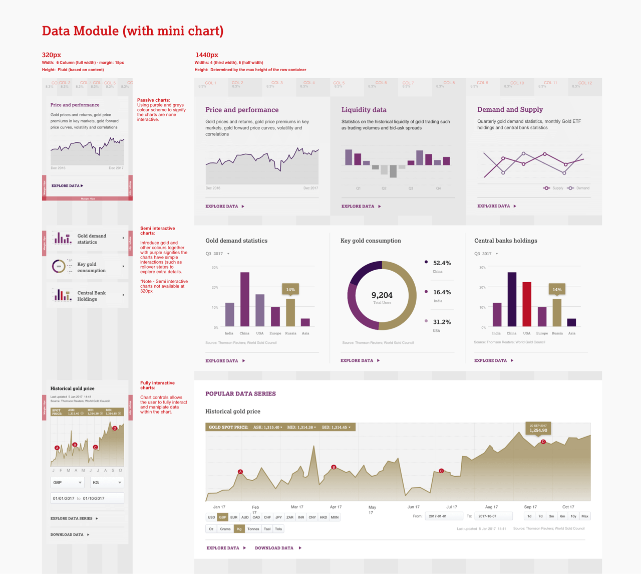
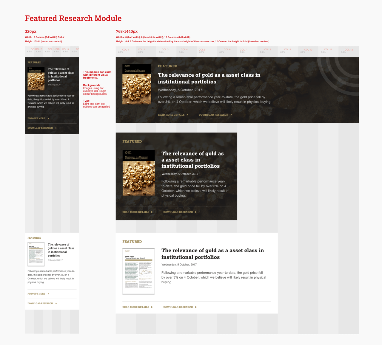
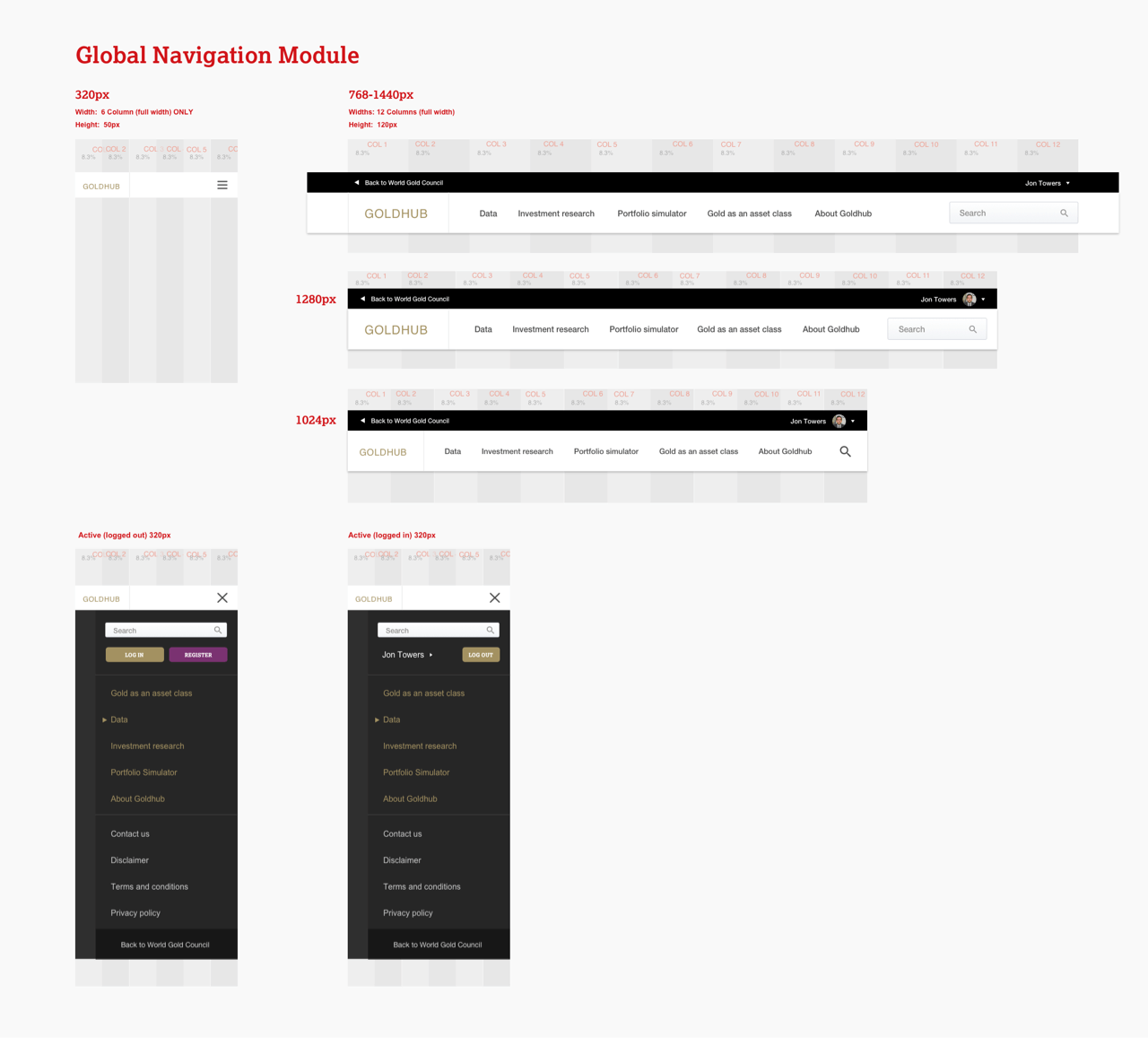
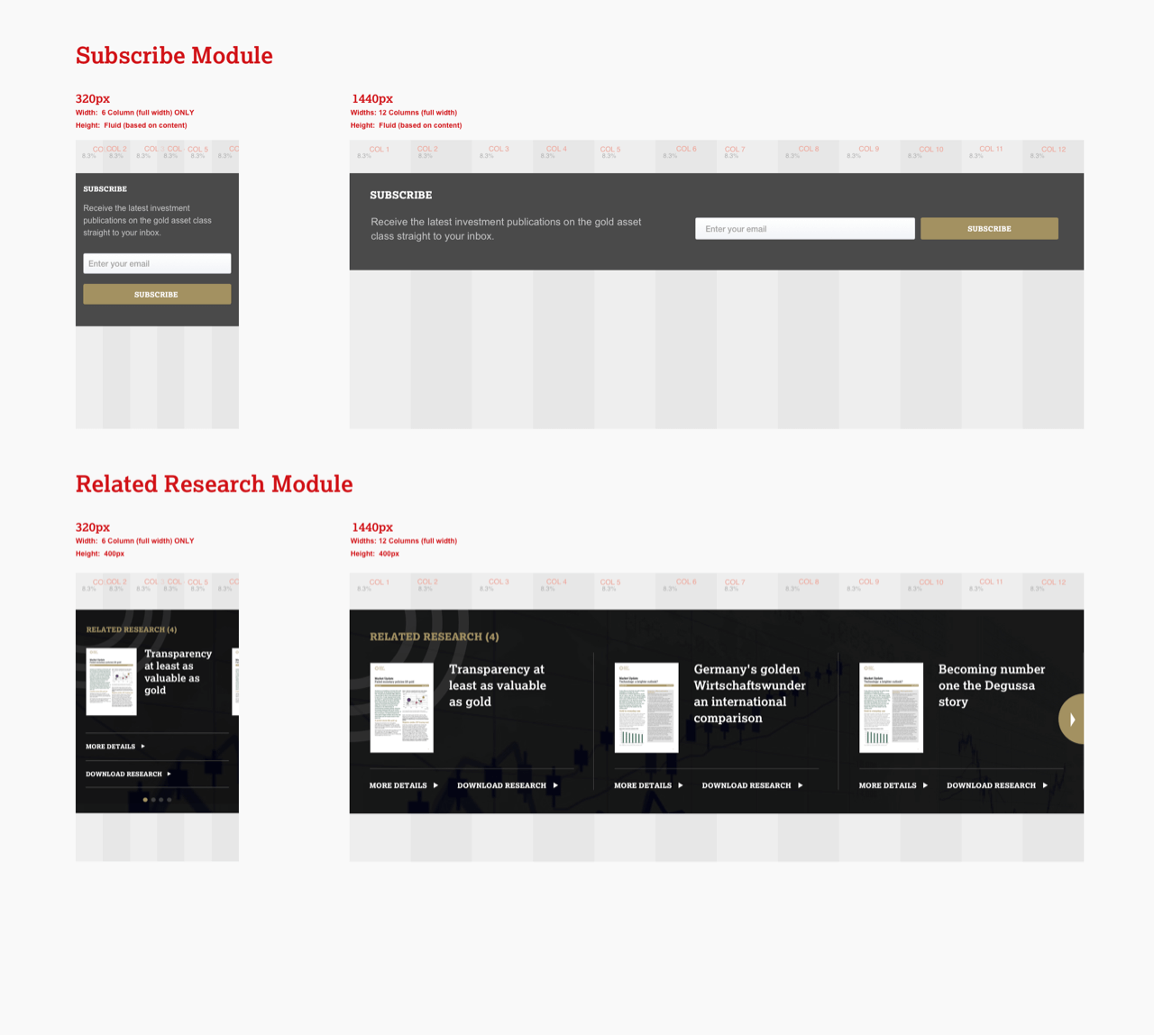
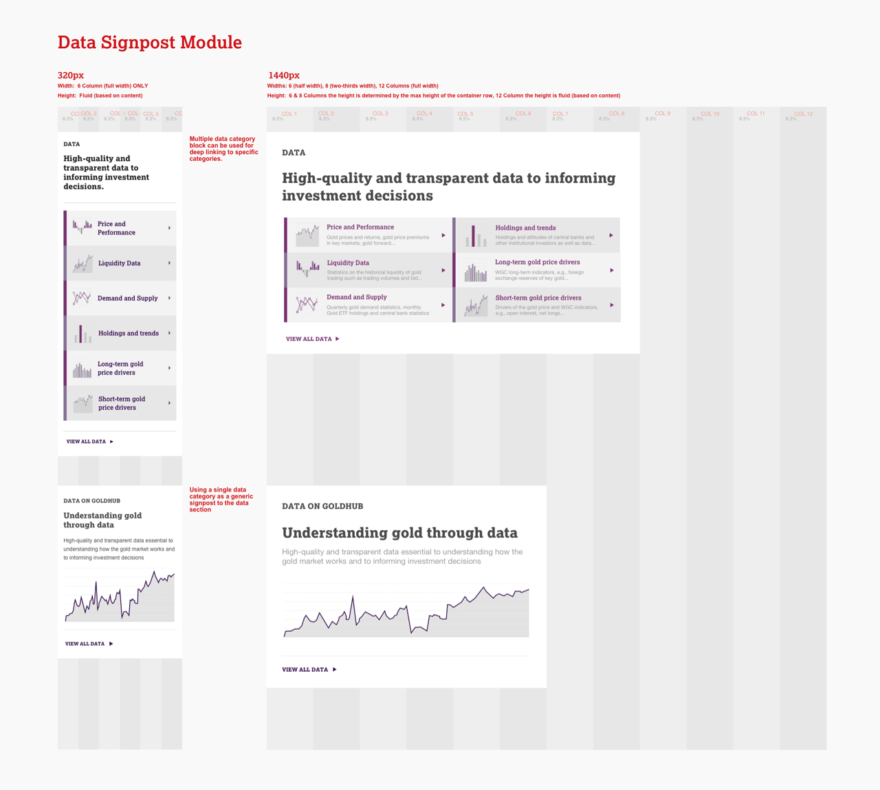
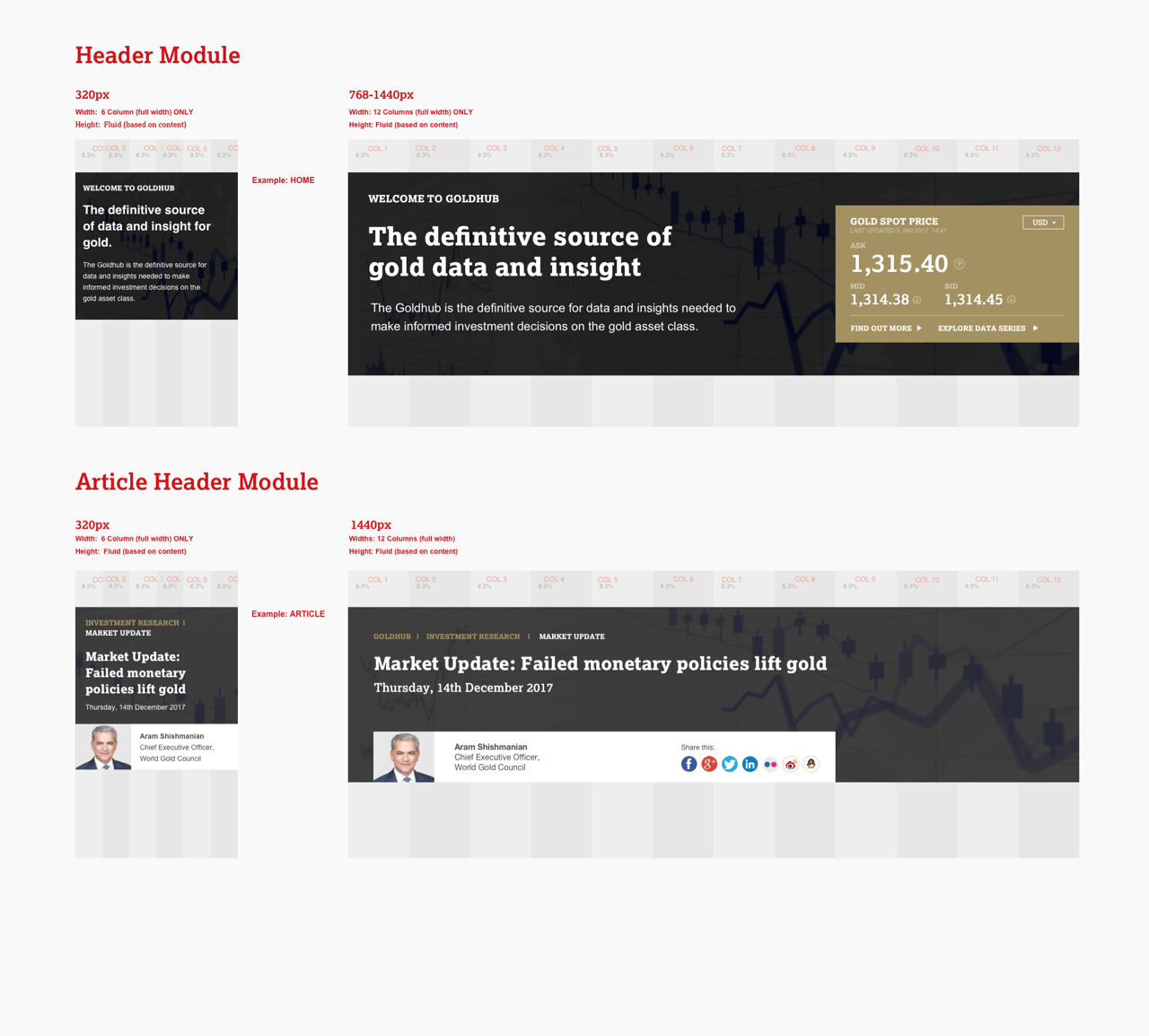
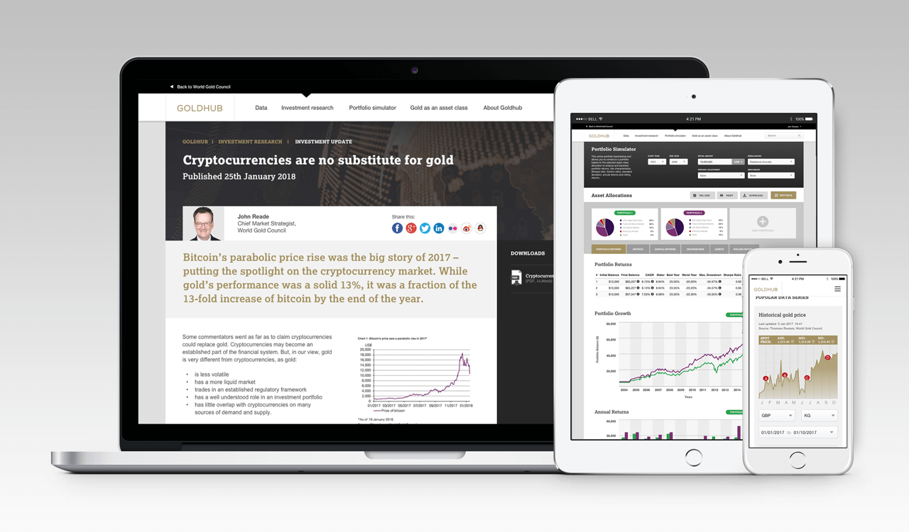
A flexible grid – Allowing the design layout and components to respond from mobile, tablet and desktop viewports.
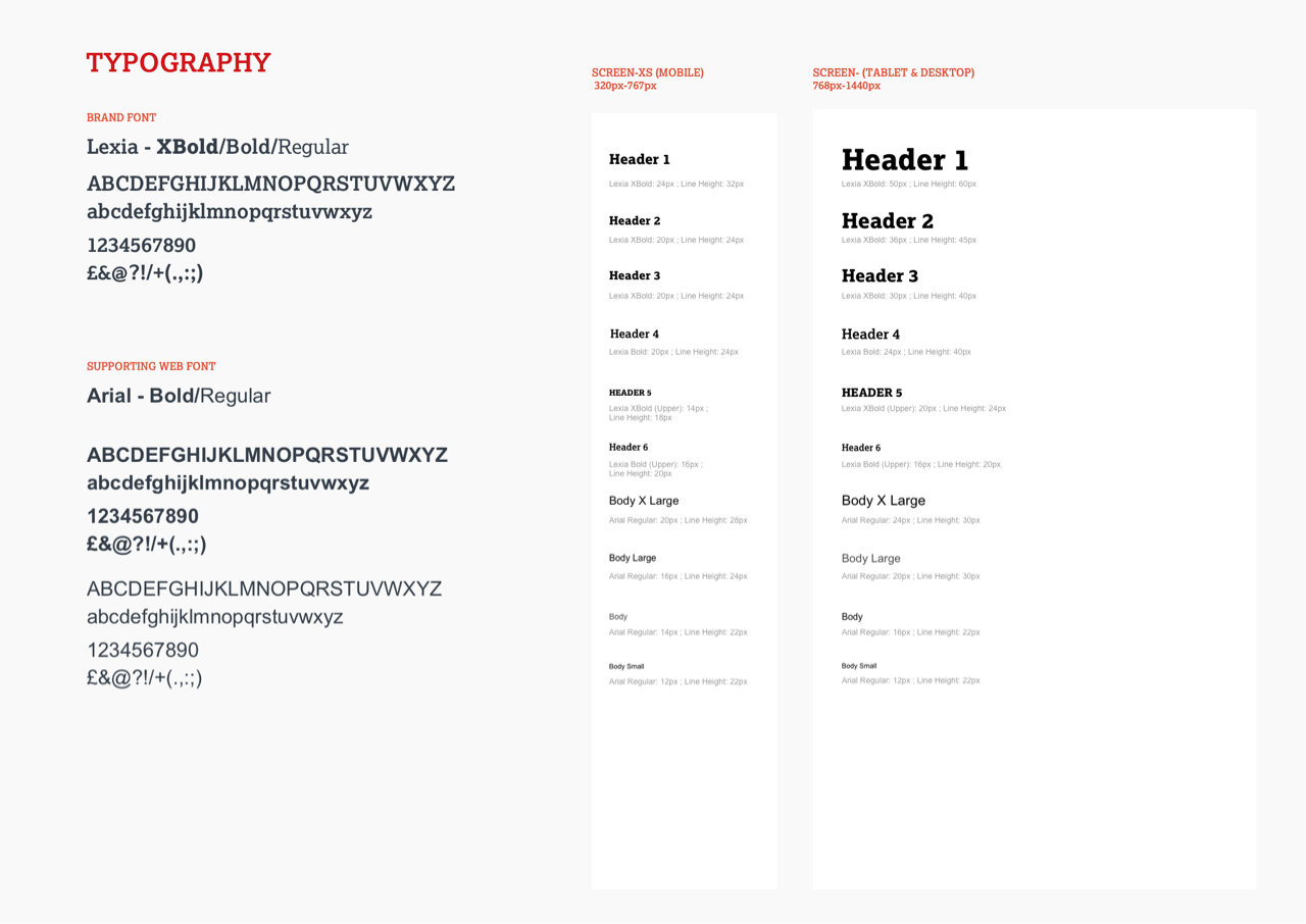
Typography – Use of typography to create a hierarchy within content.
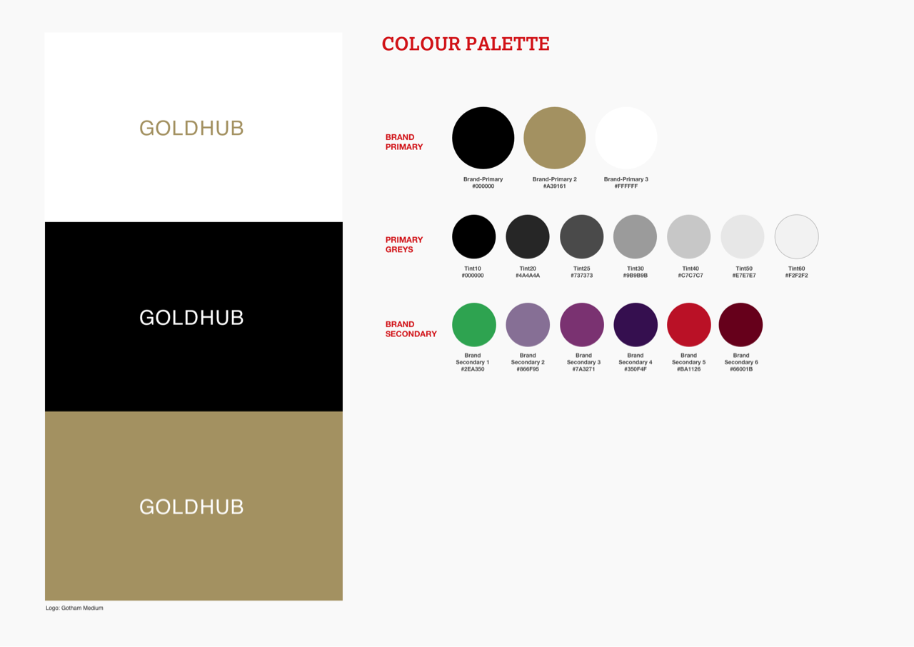
Colour palette evolution – Broadening the use of the primary and secondary colour palettes – Particularly in charting and data visualisation throughout the designs.
Chart treatments – Exploring the use of monotone or single colour for passive charts and bringing in more colour as interactivity increases.

Defining responsive components
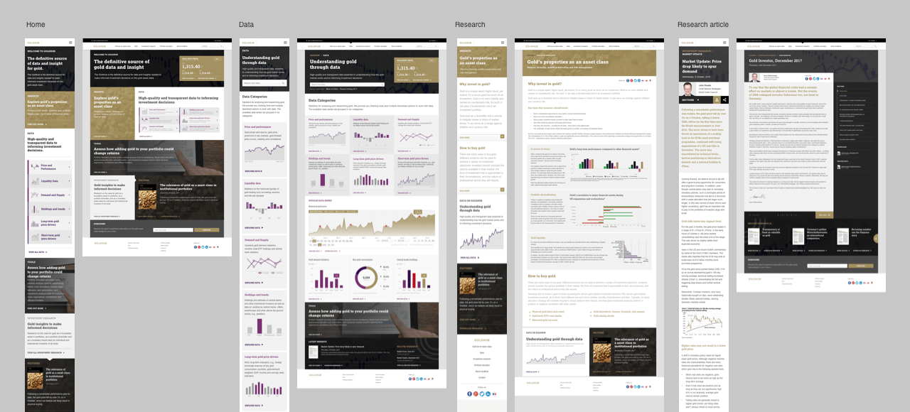
Part of our brief was to design a responsive solution that would display across different screens and devices. For this purpose we defined a flexible grid and designed components in a modular fashion to adapt the content and layout.




Building rapid prototypes
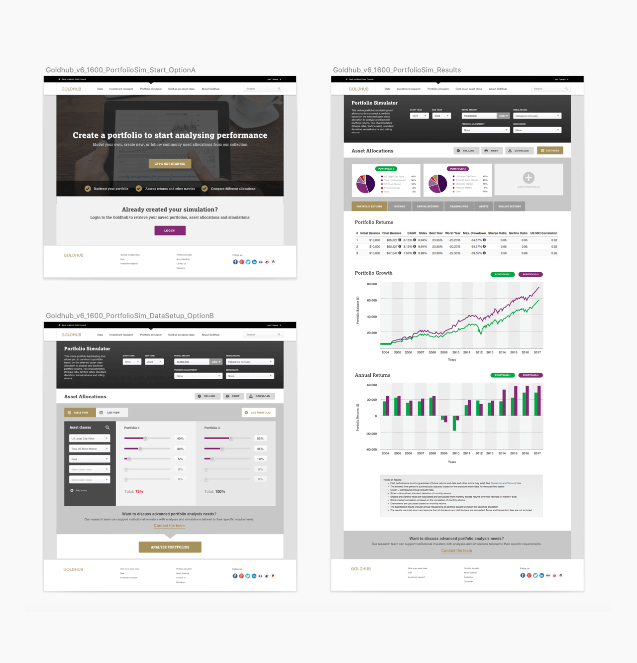
We used InVision to product prototypes, which allowed users to interact and click around the prototype during their interview sessions and give feedback . This allowed us to test users expectations and reactions to the information architecture, page features and the content. The analysis from this user feedback allowed us to further refine the designs.
User testing and interviews
We ran interviews with a variety of participants to gauge their thoughts and feedback. All participants were professional investors or analysts at different levels, that would be potential customers for this new product. The interviews were structured to collect feedback about the proposition but also to gain insights into their behaviours and processes while doing their jobs.
Evaluation of user testing and next steps
Overall the feedback from user testing was very positive and proposition resonated well. The initial hypothesis of bringing data, analysis tools, expert research and commentary into a single product showed to be an appropriate direction for this new product and it was our recommendation that the proposition had a good opportunity to succeed in it’s goal of helping investors and analysts
Participants commented that the site is easily navigable, and found it easy to dive in to the details within cards
Users widely understood the propostions and stated that this product would help plug gaps in investor knowledge.
Access to correct data supposed by relevant research scored high with all users
The site was seen as “clean” and “modern”, and maintained a brand consistency and credibility.
Following this design and testing phase, further design iterations and testing is planned including a more detailed content strategy. Discussions are also planned with the client’s development partners to work out the best course of action regarding the process for product build.


